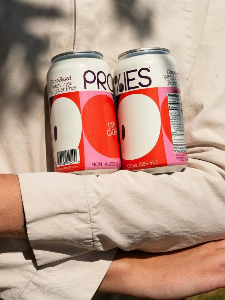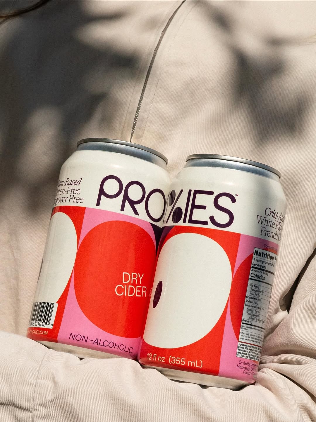
Proxies uses spare lettering and stacked circles that are reminiscent of midcentury labels, designed by Martha. The can is clear, instantly, with generous white space and confident color blocking. It sidesteps wellness clichés, which is entirely refreshing within the non-alcoholic space.